
[PT] O Néctar da Vida
Como despertar entusiasmo genuíno pela saúde em um mercado que ainda fala de dietas e restrições? A Trees nasce dessa provocação, trazendo uma verdade simples e poderosa: a saúde é o nosso néctar mais doce.
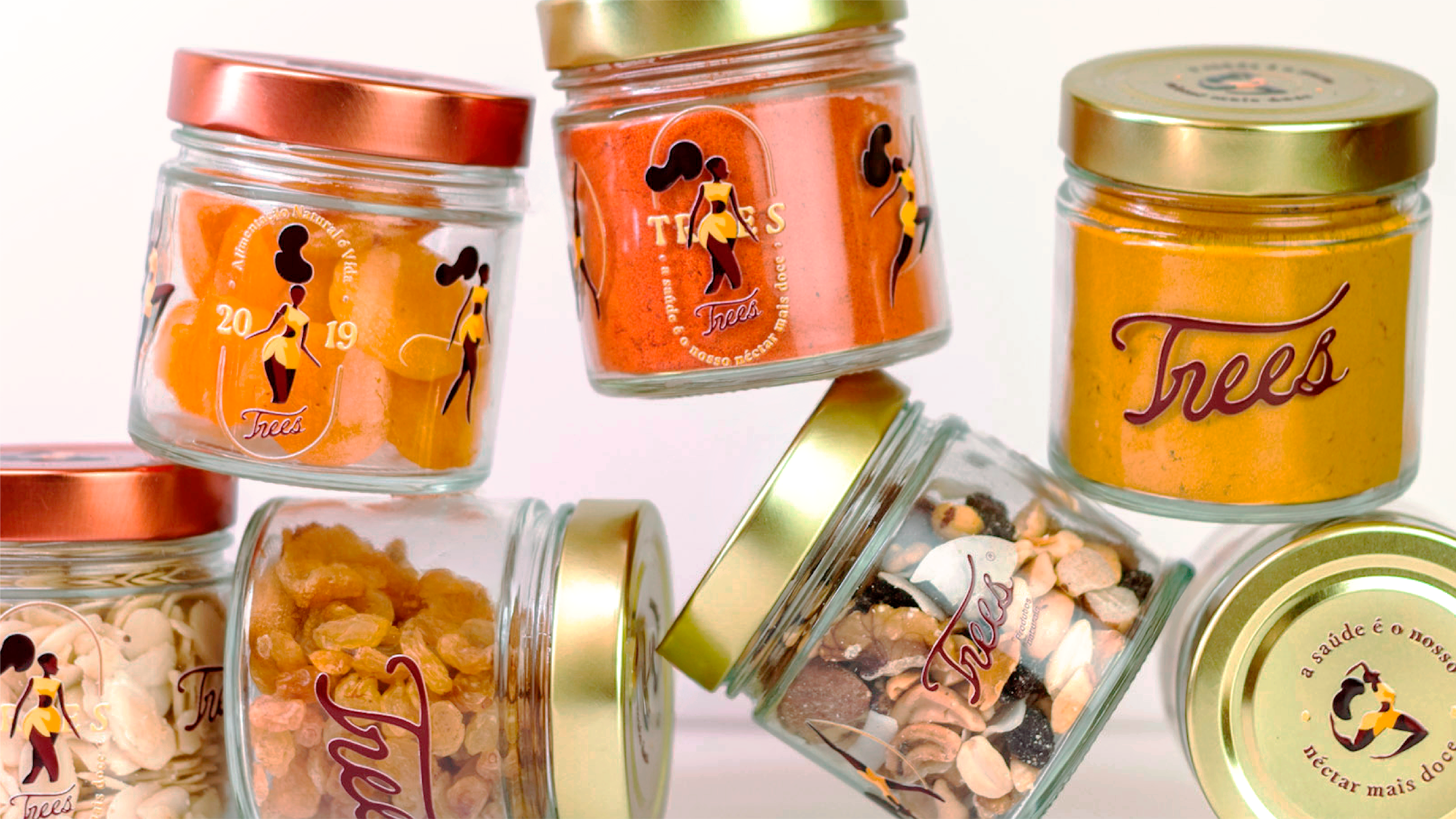
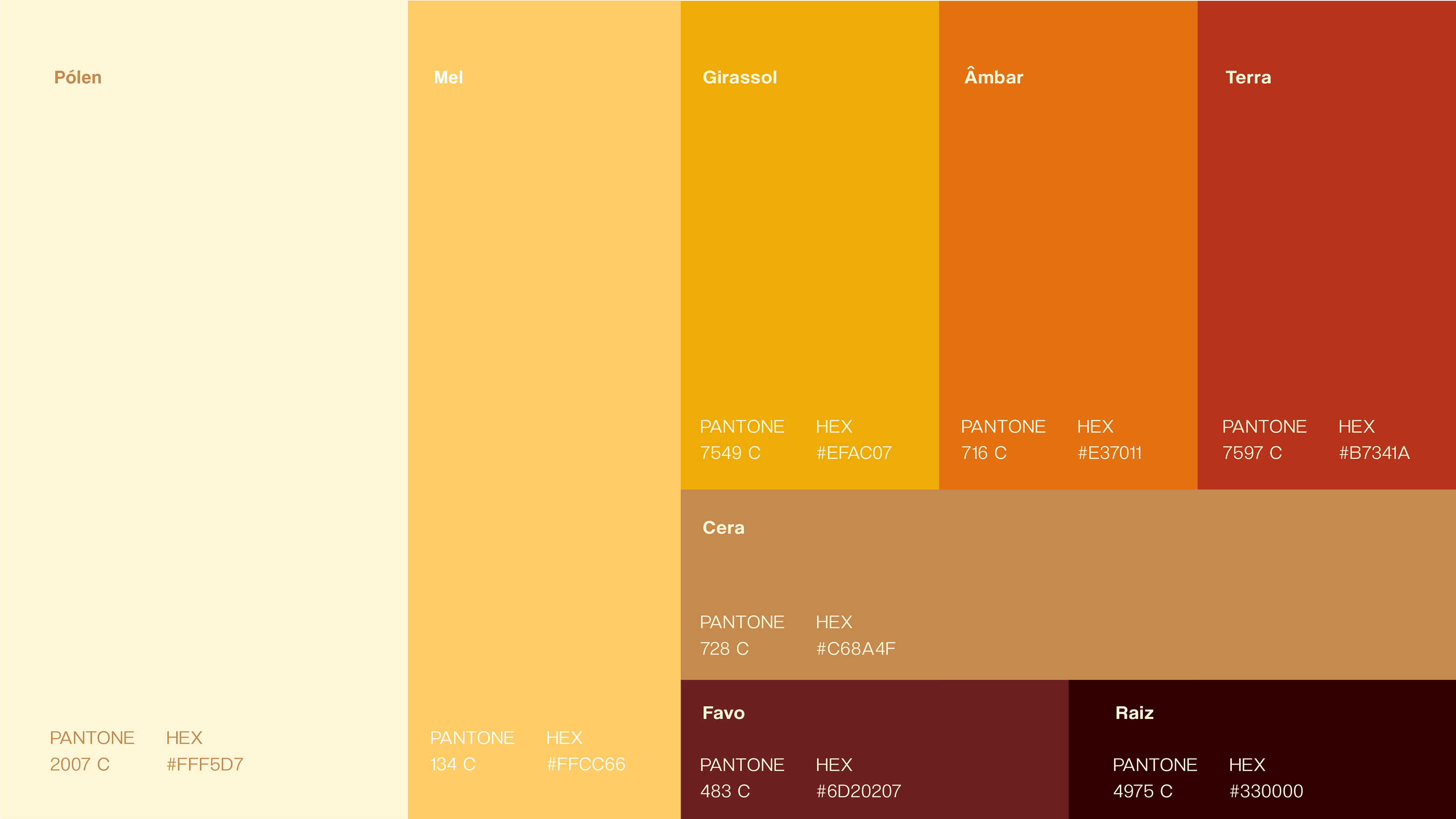
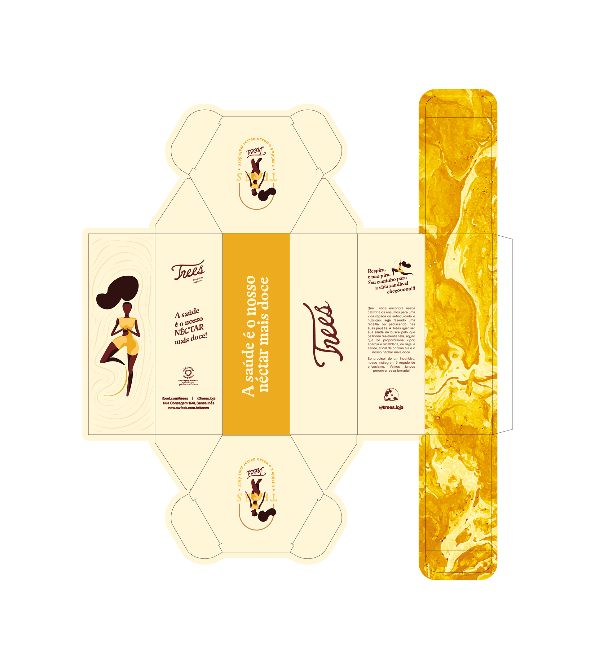
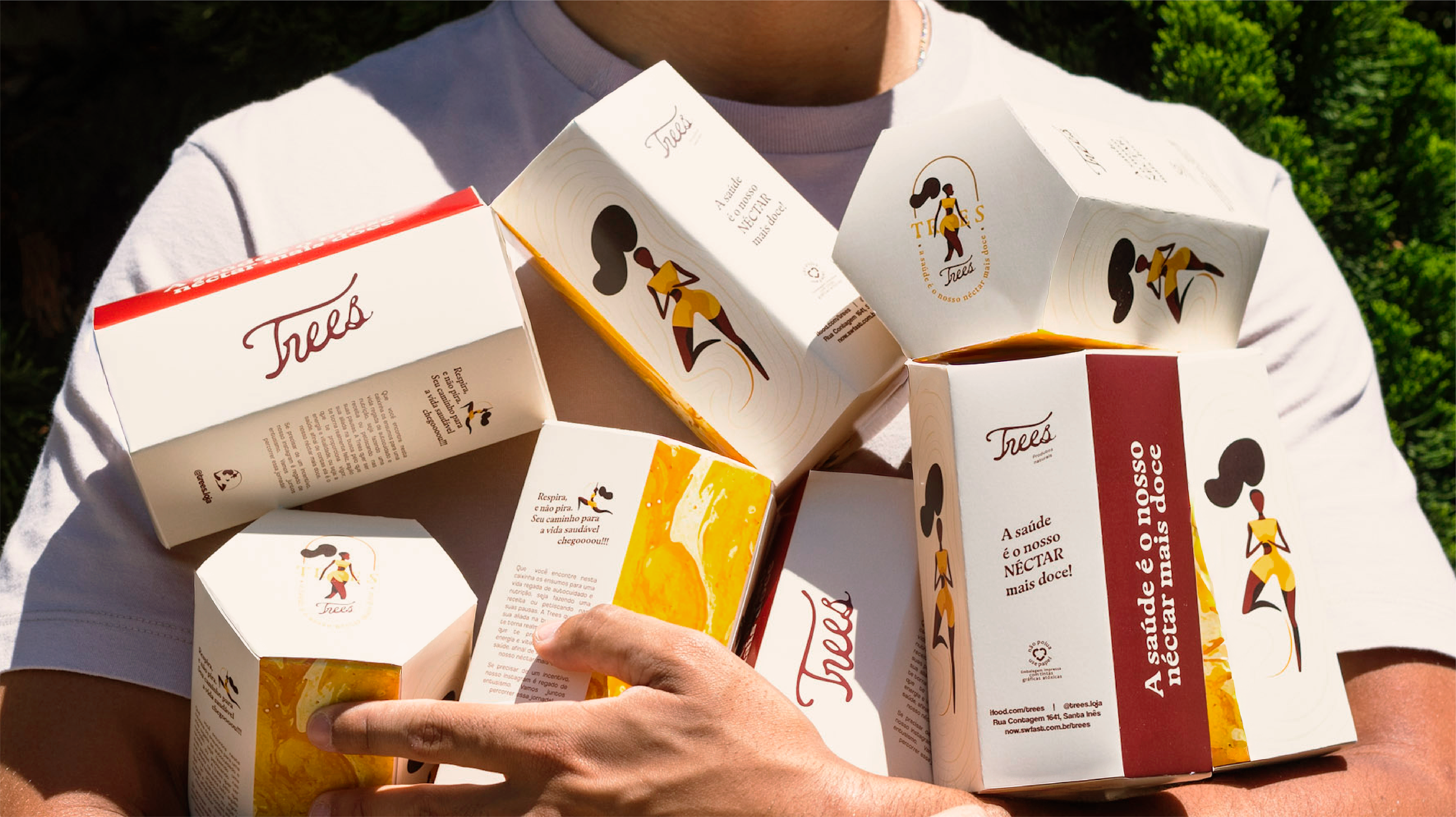
Inspirada no mel — alimento ancestral que nutre, cura e renova— a marca traduz em cada detalhe a ideia de que o cuidado com o corpo deve ser fonte de prazer, não de sacrifício. Este, símbolo de energia vital e de conexão com a natureza, tornou-se a alma do projeto e o ponto de partida para toda a expressão da marca.
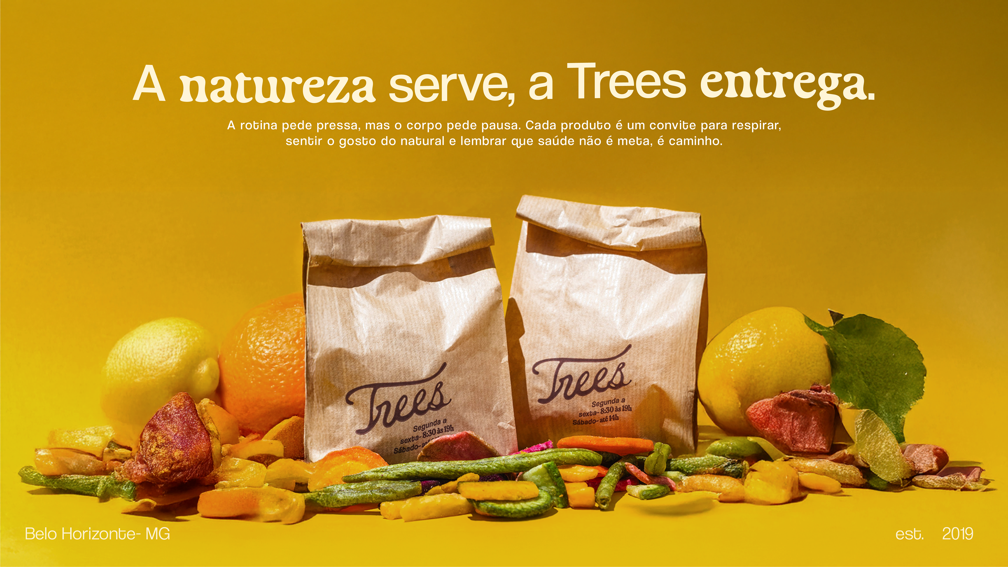
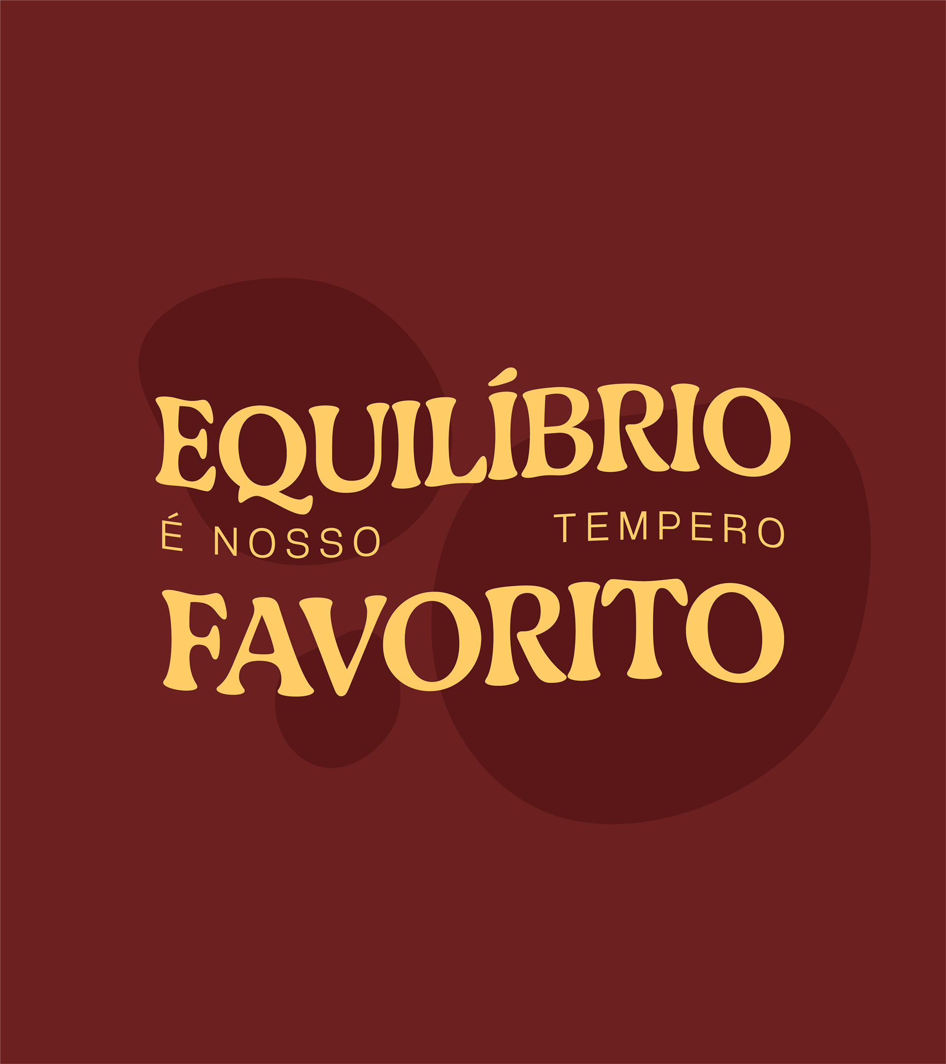
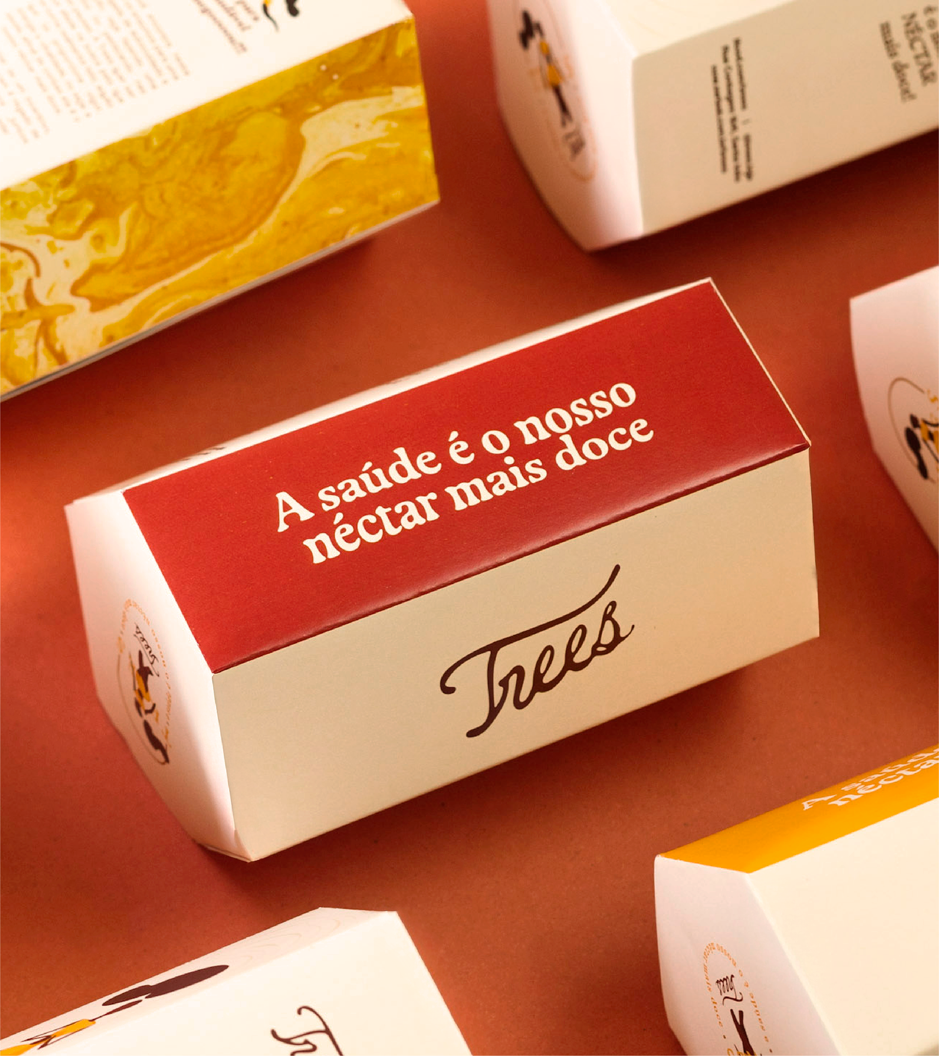
Enquanto o mercado insiste em promessas funcionais e visuais previsíveis, a Trees escolheu o caminho da celebração. Saúde e sabor caminham juntos. O posicionamento é claro: a saúde vem primeiro, mas o caminho até ela precisa ser acolhedor, vibrante e cheio de sabor.
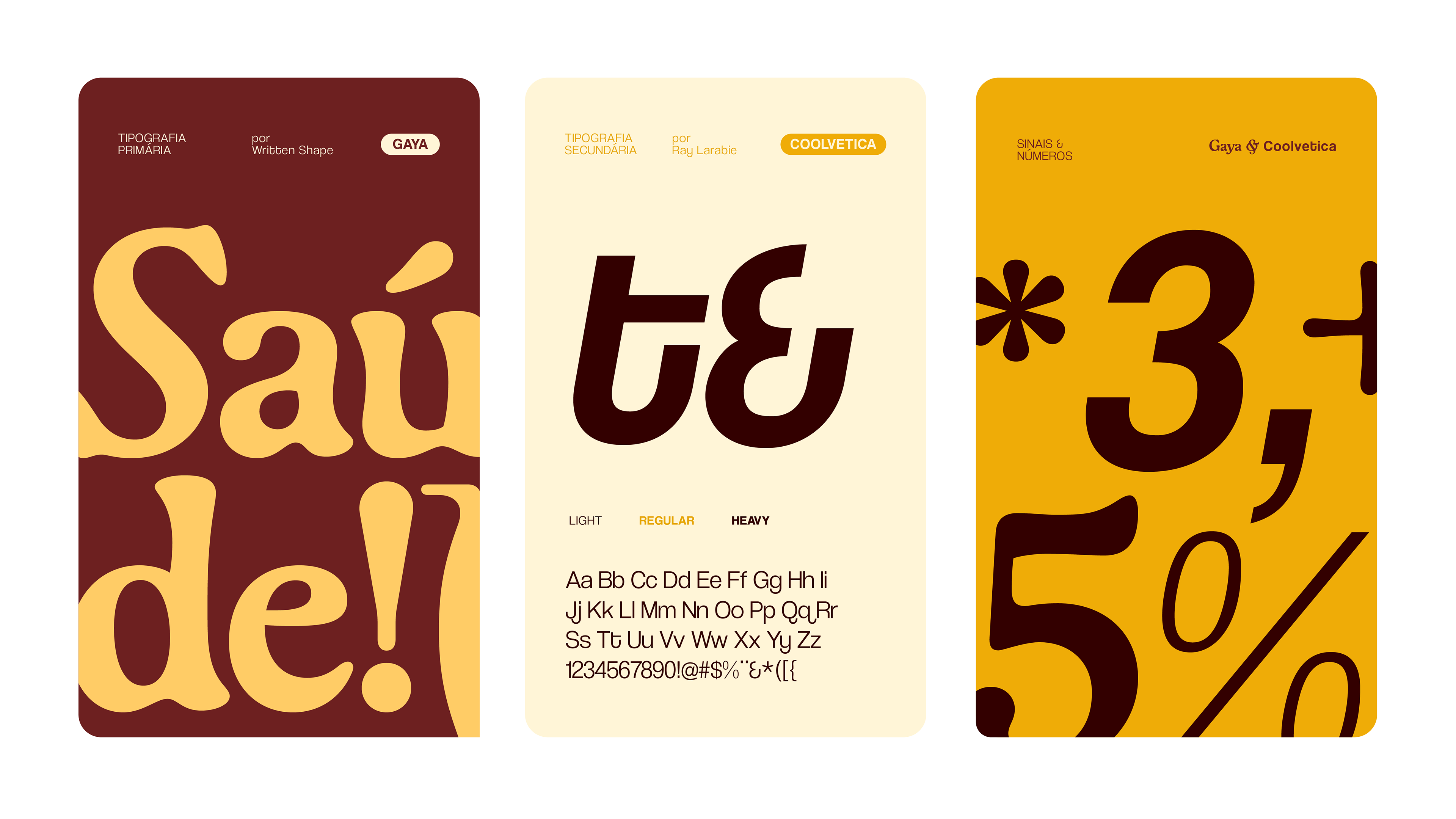
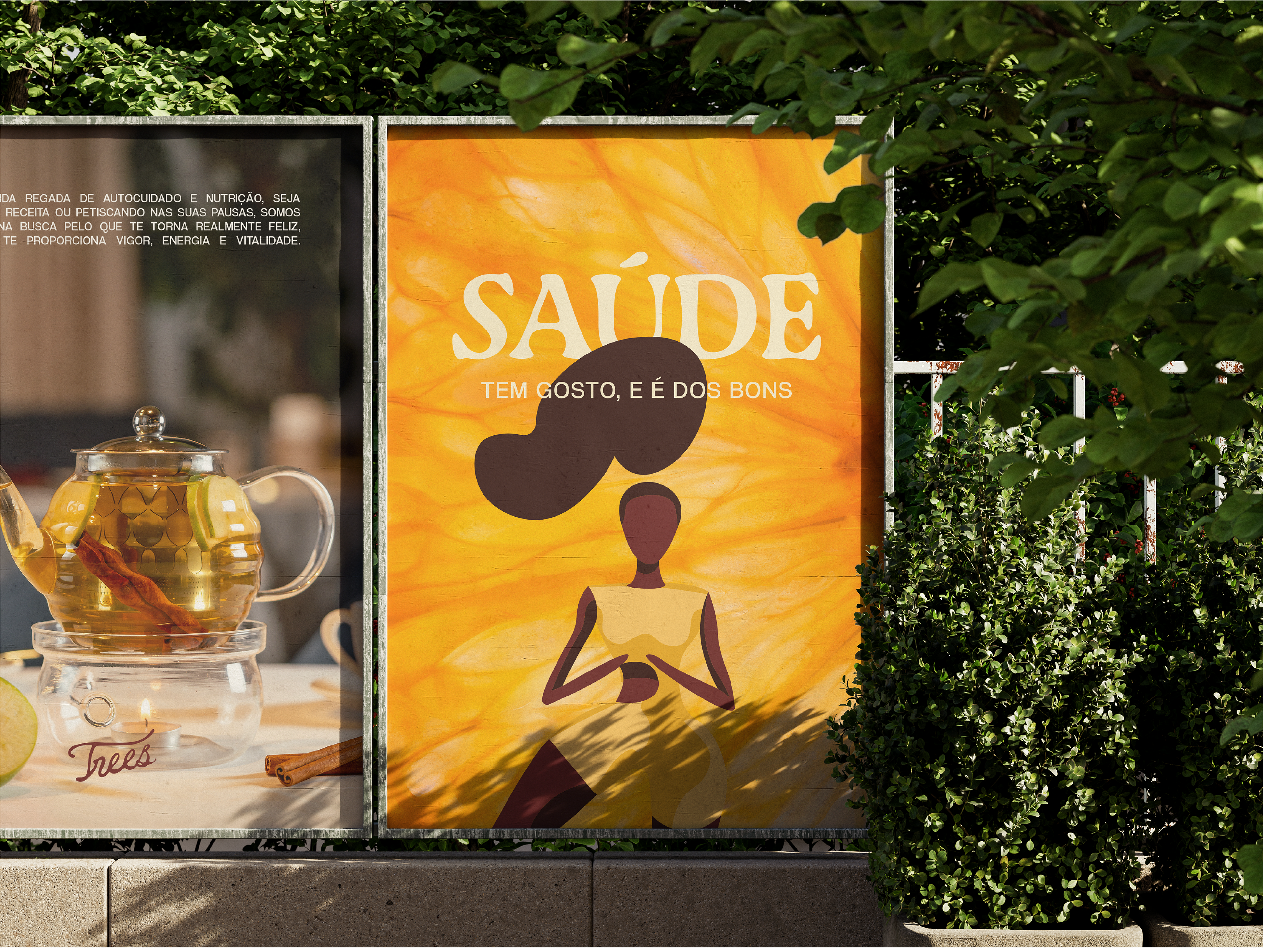
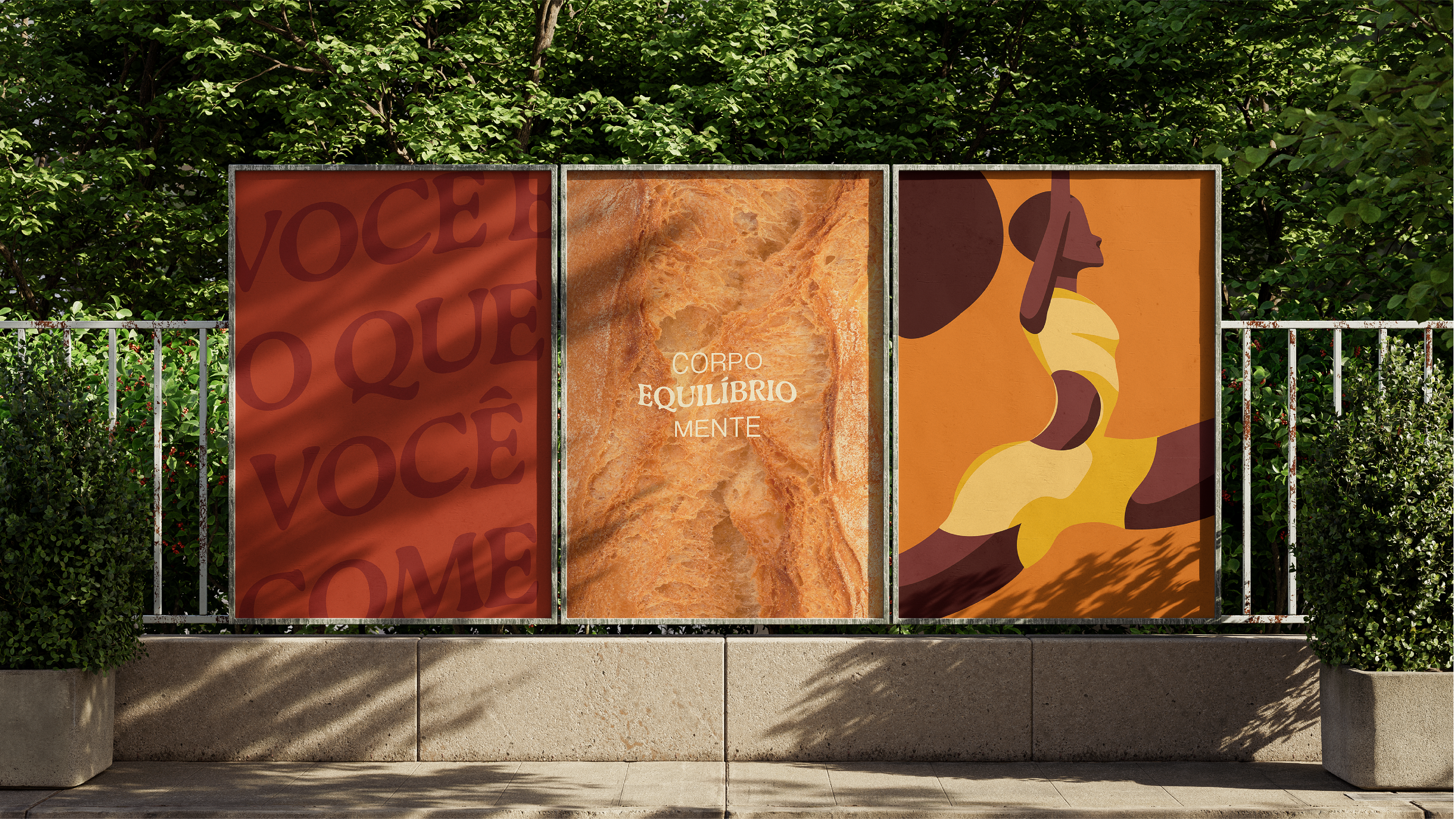
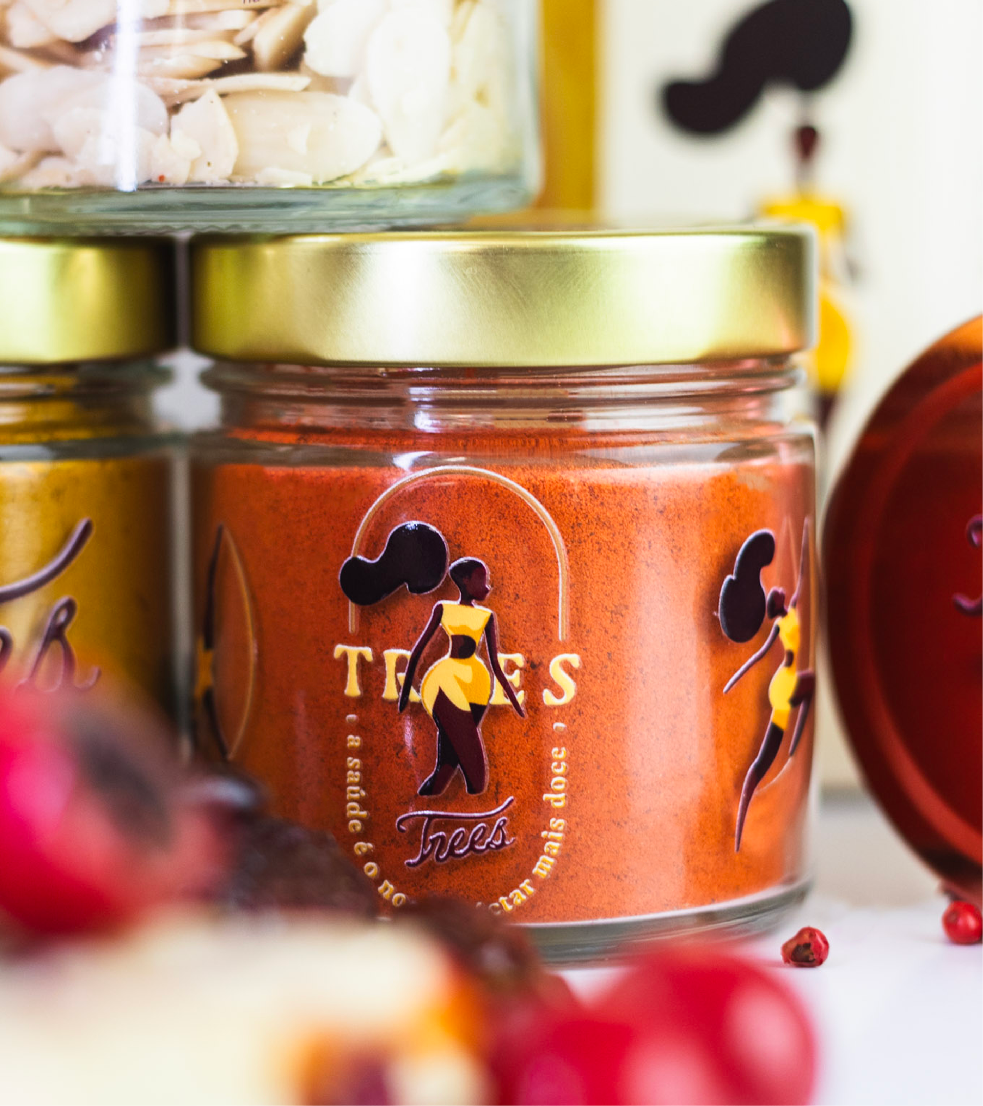
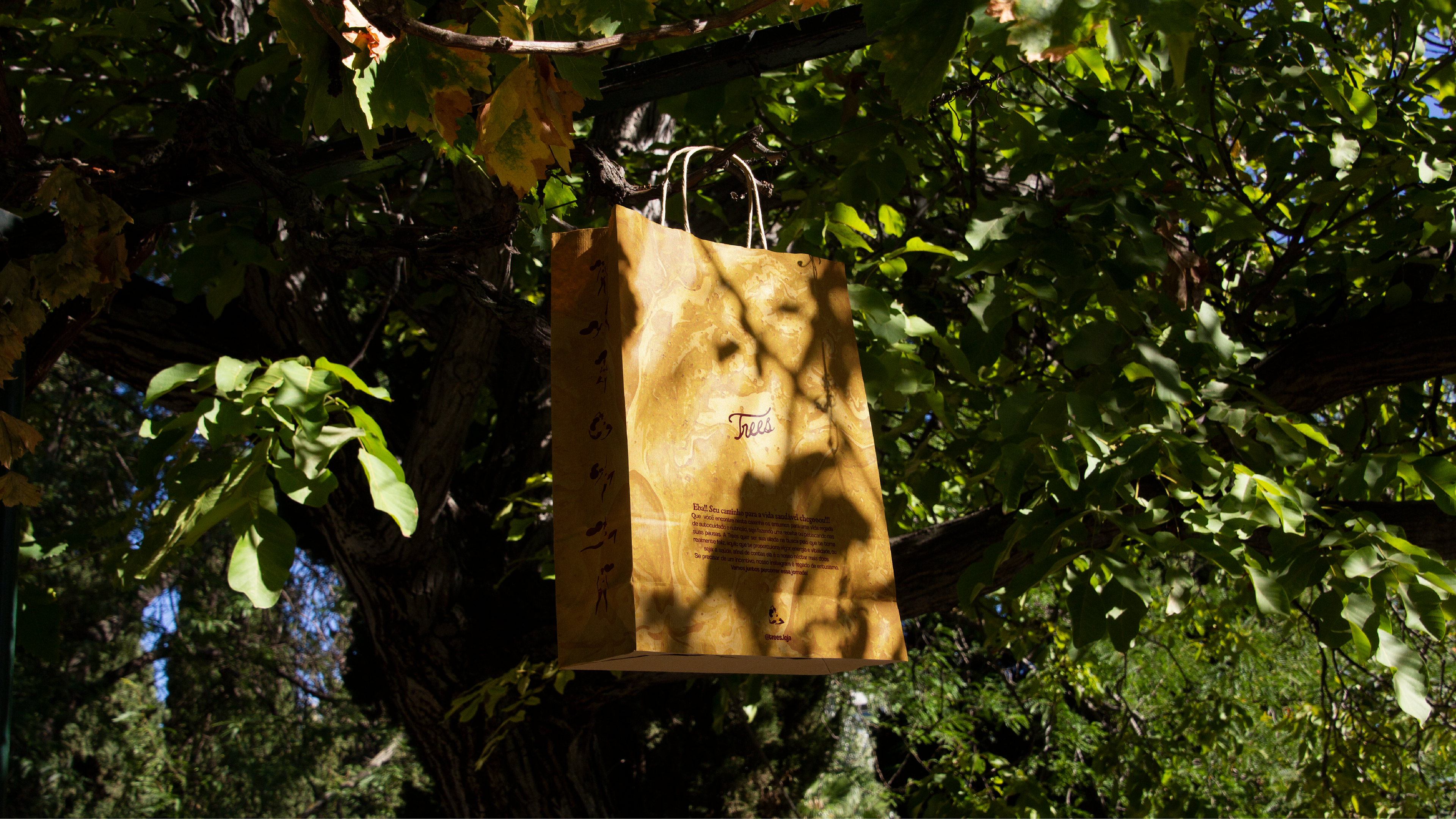
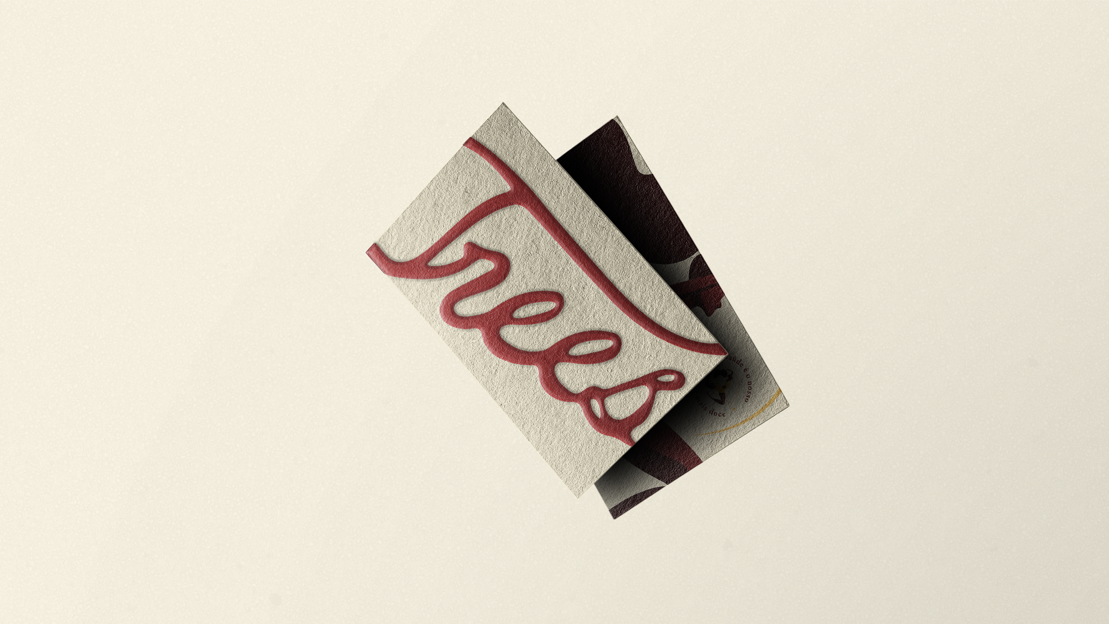
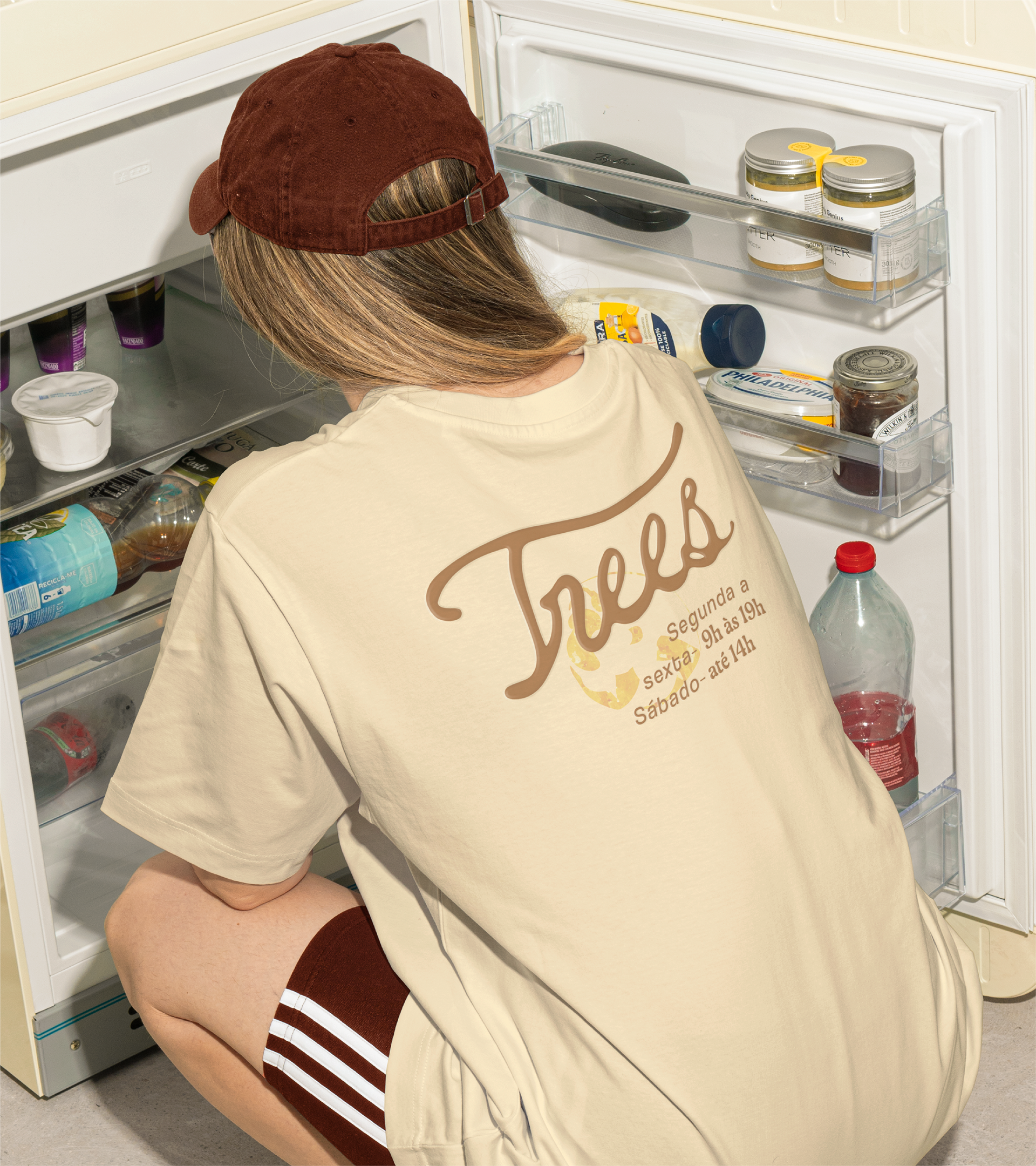
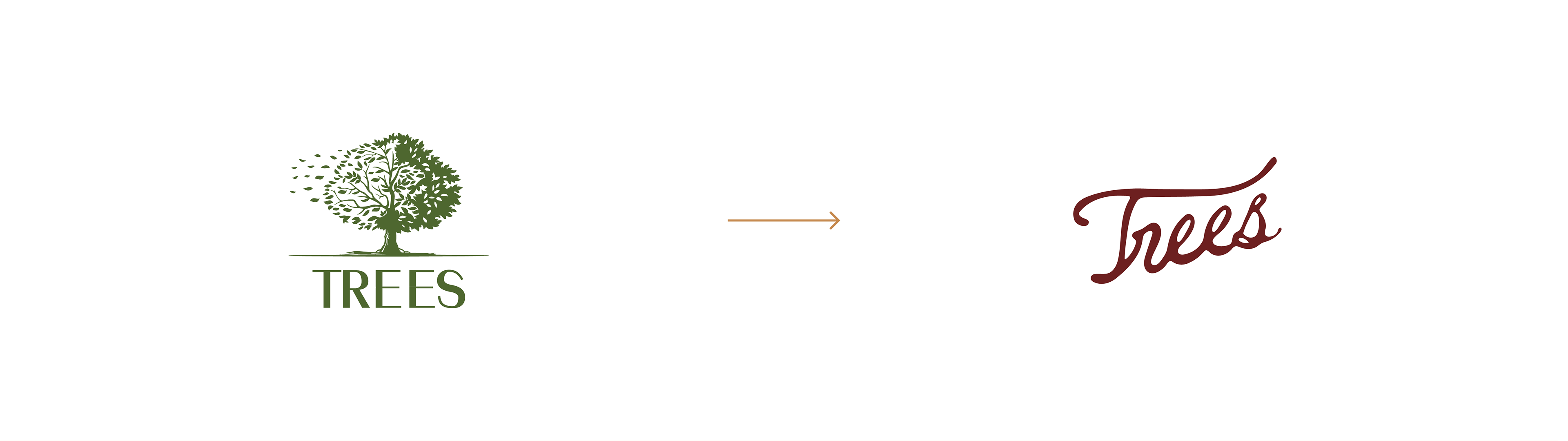
O logotipo manuscrito reflete a fluidez do néctar e a densidade dos alimentos naturais, com traços orgânicos que preservam a autenticidade do gesto humano. Para personificar essa filosofia, nasceu uma personagem inspirada nas abelhas, guardiãs do néctar e símbolo de vitalidade. Ela não é mascote, mas a representação viva do espírito Trees: ativa, leve e comprometida com o bem-estar coletivo.
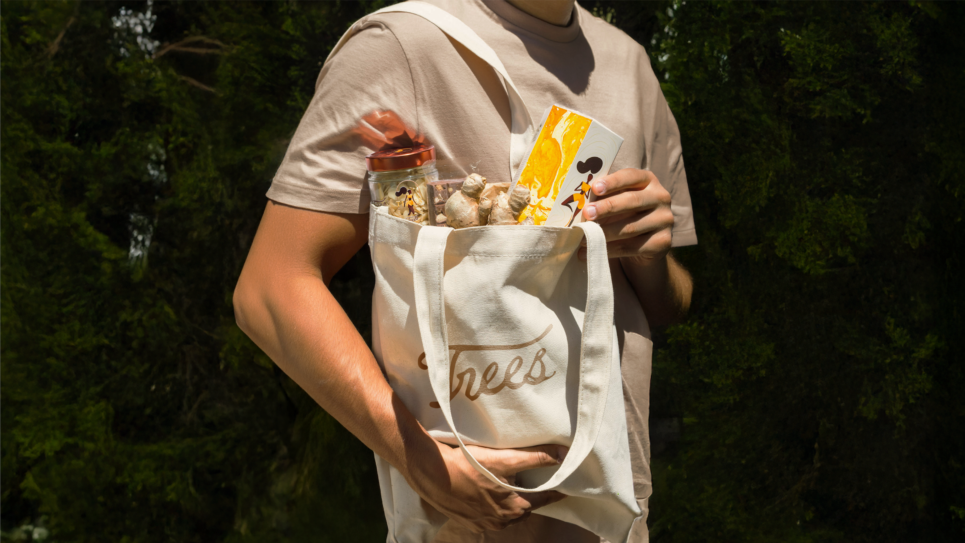
O resultado é uma identidade que não fala de renúncia, mas de celebração. A Trees não vende produtos naturais, vende a experiência de cuidar de si com alegria, equilíbrio e sabor. Cada elemento visual e verbal foi criado para despertar uma sensação: há algo de especial em parar para saborear o que nos faz bem.
[EN] The Nectar of Life
How can we spark genuine enthusiasm for health in a market still dominated by diets and restrictions? Trees was born from this very question, carrying a simple yet powerful truth: health is our sweetest nectar.
Inspired by honey — an ancestral food that nourishes, heals, and renews — the brand expresses in every detail the belief that caring for the body should be a source of pleasure, not sacrifice. Honey, a symbol of vital energy and connection with nature, became the soul of the project and the starting point for the brand’s entire expression.
While the market insists on functional claims and predictable visuals, Trees chose the path of celebration. Health and flavor walk together. Its positioning is clear: health comes first, but the journey toward it must be warm, vibrant, and full of taste.
The handcrafted logo reflects the fluidity of nectar and the richness of natural foods, with organic strokes that preserve the authenticity of a human touch. To personify this philosophy, a character inspired by bees, the guardians of nectar and symbols of vitality, came to life. She is not a mascot, but the living embodiment of the Trees spirit: active, light, and devoted to collective well-being.
The result is an identity that doesn’t speak of renunciation, but of celebration. Trees doesn’t sell natural products, it sells the experience of caring for oneself with joy, balance, and flavor. Every visual and verbal element was designed to awaken a single feeling: there’s something special about pausing to savor what makes us feel good.
Brand Strategy, Visual Identity & Packaging Design: Sofia Borges
Motion Design & 3D: Cassiano Gustavo
Illustration: Arthur Randolpho
Year: 2023
Location: Belo Horizonte, MG — Brasil