PT
O Colégio Caminhos&Colinas, da Zona Sul de São Paulo, sempre soube muito bem a missão que carrega: formar pessoas íntegras, excelentes nos estudos e capazes de contribuir positivamente para a sociedade.
O curioso é que, sua marca ainda não contava essa história tão bem quanto poderia. Faltava alinhar a conversa com as famílias, fortalecer o senso de pertencimento dos professores e tornar mais clara a relevância da escola para quem ajuda a mantê-la todos os dias.
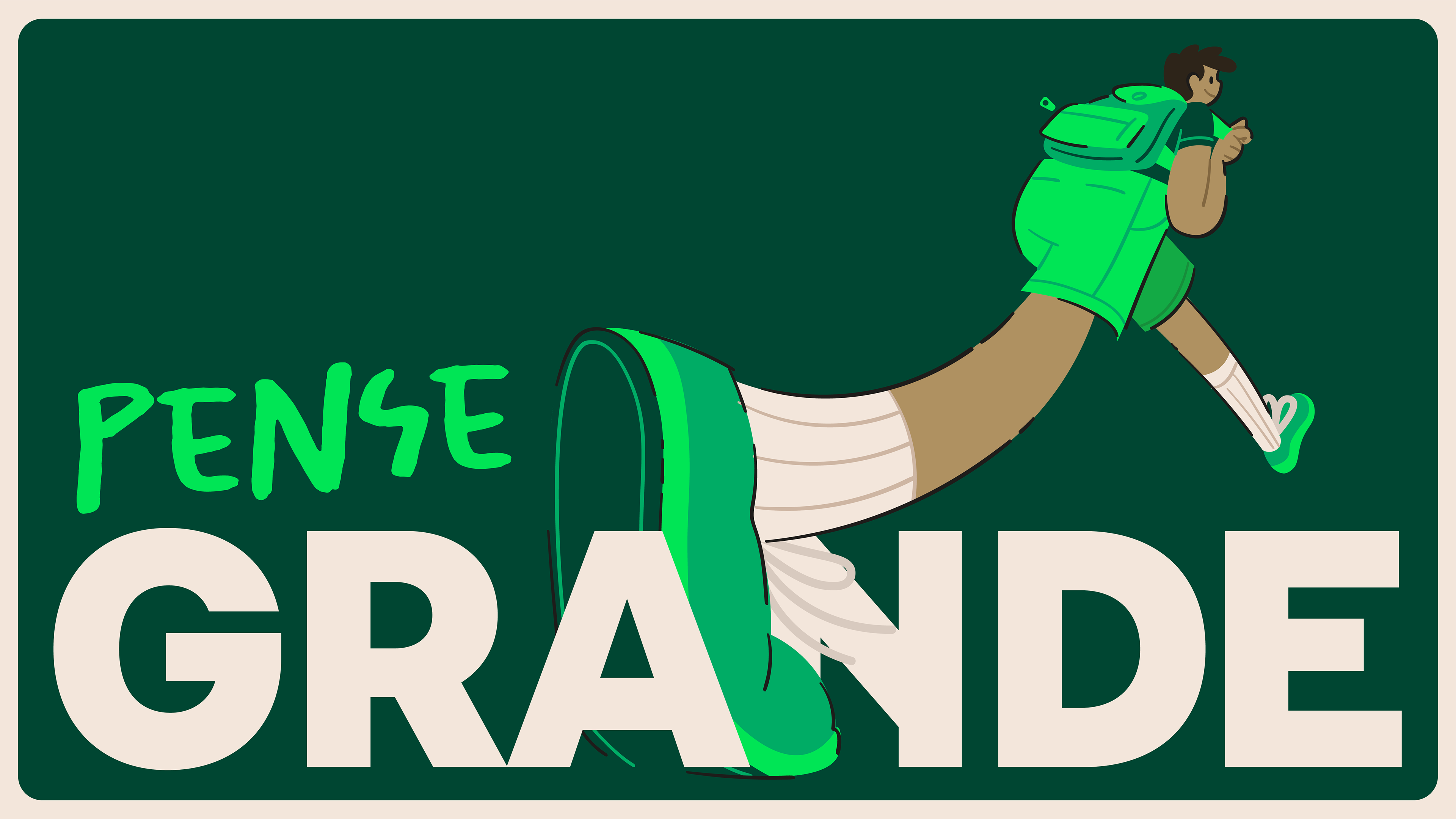
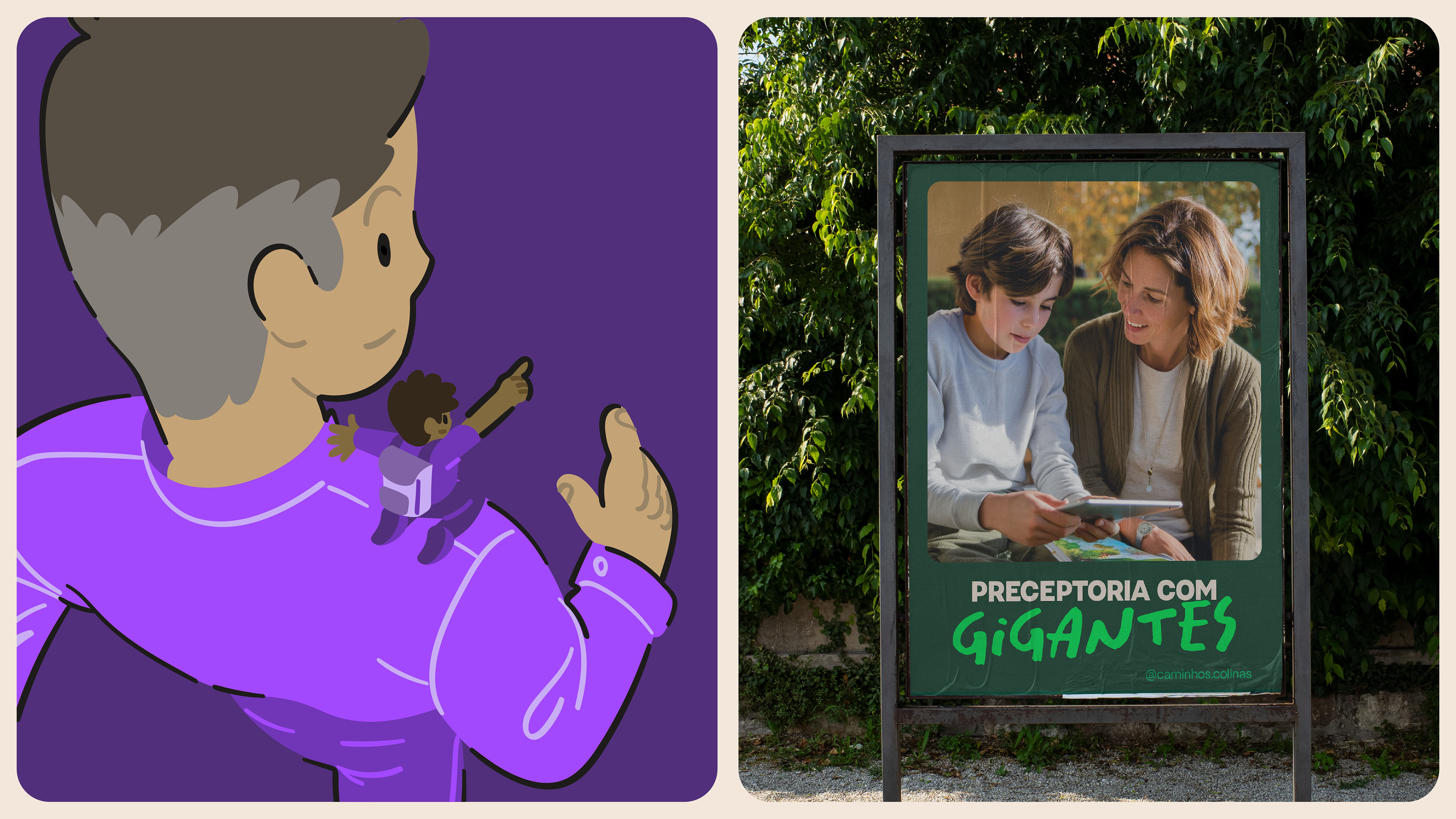
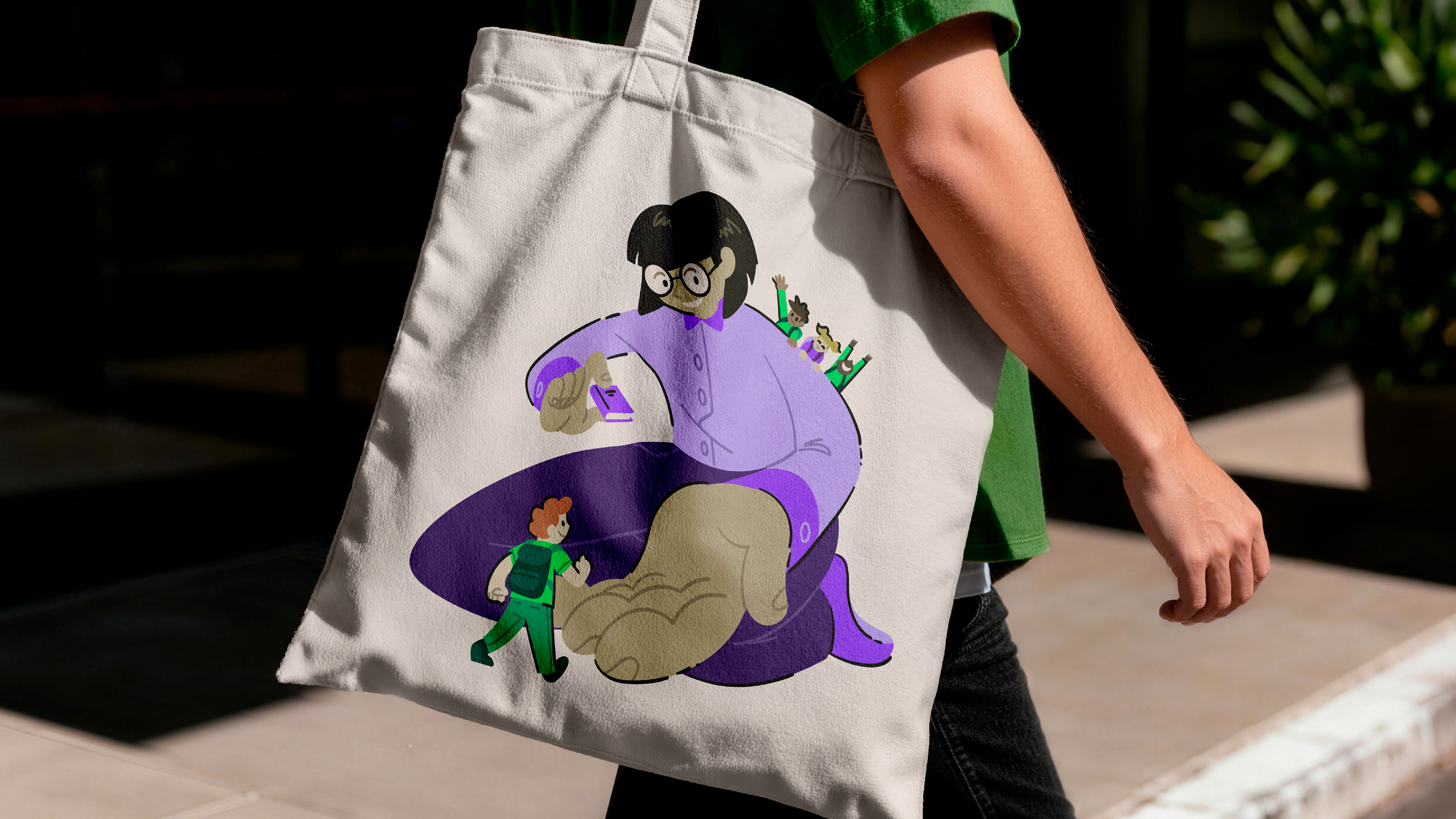
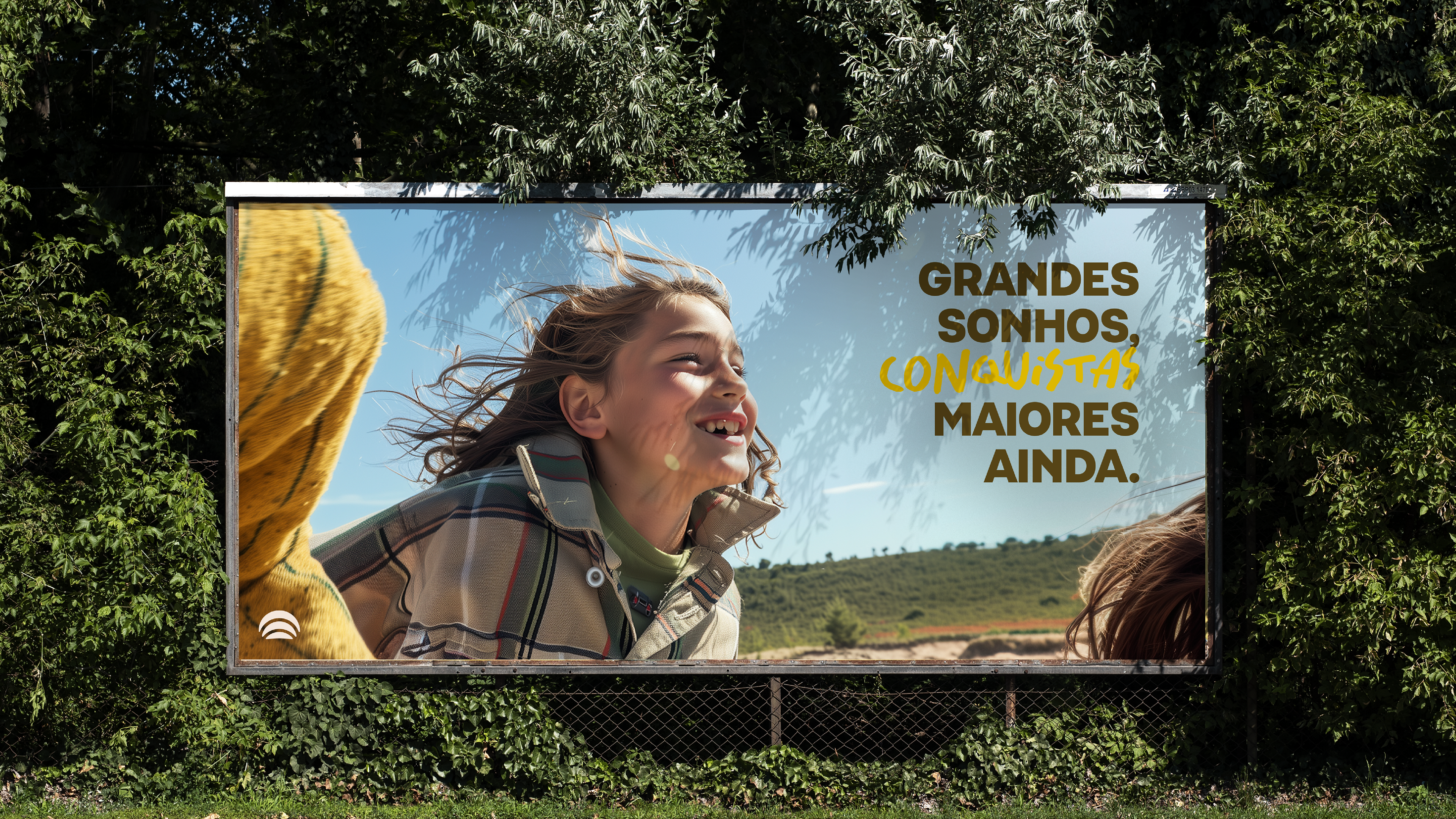
Quando mergulhamos em seu universo, encontramos algo precioso: um método de ensino capaz de formar pequenos gigantes. Alunos que aprendem a olhar além de suas realidades, pensar grande e crescer elevando também aqueles que estão ao seu redor.
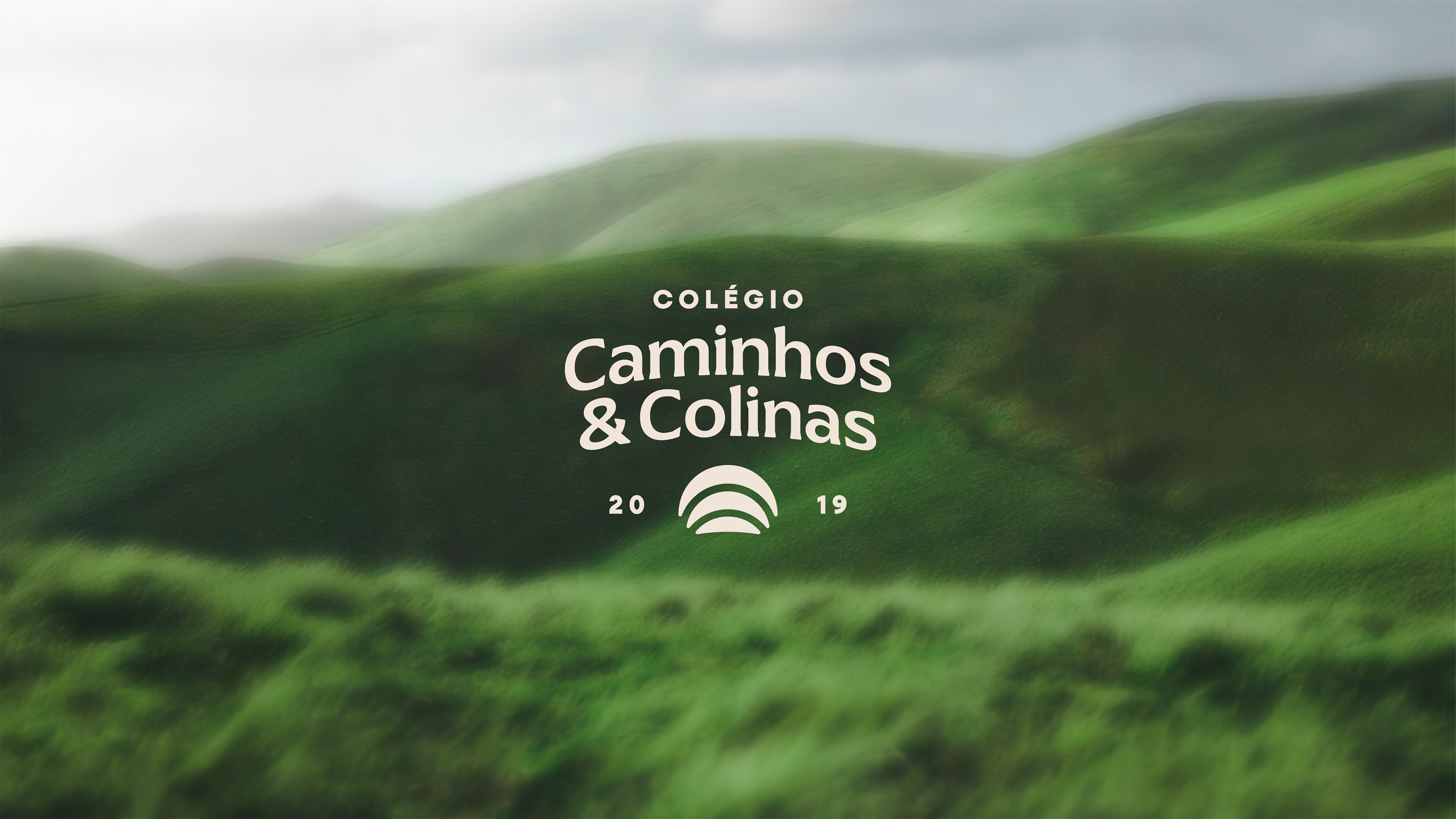
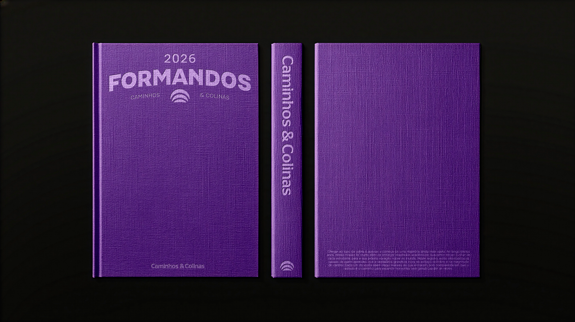
Foi dessa ideia que nasceu a nova identidade. Reunimos os três pilares da instituição (pais, professores e alunos) para construir um símbolo que representasse crescimento e união através do trabalho em conjunto.
As fotografias e ilustrações brincam com enquadramentos mais aproximados, provocando distorções intencionais que somadas às cores vibrantes e tipografias joviais traduzem a ambição e o acolhimento necessários.
O resultado é uma marca clara e consistente, que finalmente comunica a grandeza daquilo que já acontecia dentro da instituição todos os dias.
EN
Caminhos&Colinas School, located in the southern zone of São Paulo, has always been very aware of its mission: to educate upright individuals who excel in their studies and are capable of contributing positively to society.
Interestingly, its brand was not telling that story as effectively as it could. There was a need to better align the conversation with families, strengthen teachers’ sense of belonging, and more clearly communicate the school’s value to those who help sustain it every day.
When we immersed ourselves in its world, we uncovered something truly special: an educational approach capable of shaping little giants. Students who learn to look beyond their own realities, think bigger, and grow in a way that also elevates those around them.
From this idea, the new identity was born. We brought together the institution’s three pillars (parents, teachers, and students) to create a symbol that represents growth and unity through collective effort.
The photography and illustrations play with close-up compositions, creating intentional distortions that, combined with vibrant colors and youthful typography, express both the ambition and warmth that define the school’s experience.
The result is a clear and cohesive brand identity that finally communicates the greatness of what has always been happening within the institution, every single day.


Sofia studio
Estratégia / Identidade Visual / Motion Graphics
Sofia Borges e Cassiano Gustavo